Roller Coaster Ride
We live in volatile times. With everything going on in the world these last few years, the stock market has been a great roller coaster ride. After a steady climb that lasted a decade came the nosedive at the start of the pandemic, followed by some G-forces and another steep climb when governments all over the world increased their quantitative easing and lowered interest rates. Lockdowns and supply chain disruptions inevitably led to increased inflation, sending unprofitable tech companies down again while expectations of interest rate hikes are sky high. There was hardly any time to breathe, as we zipped around a sharp turn and into a dark tunnel, with Russia invading Ukraine.
For investors, volatility like this is not necessarily a bad thing (if you have the stomach for it). It gives plenty of opportunities to buy some dips, or take some profits off the table. To help with this, I added some functionality to the Google Sheets I use to keep track of my stock portfolio. I also connected the Google Sheets to Tableau Public to create some stunning visualizations that stay up-to-date and are easily shared. It’s called The Dip Finder.
Google Sheets to manage my stock portfolio
Since 2018 I keep track of my various investment portfolios in Google Sheets. I will not share those here in detail with the rest of the world (my wife would kill me), but let just say that Google Sheets are awesome if you want to keep track of multiple accounts in one place, with the ability to access all the functionality and data of Google Finance. For example, to get the current share price of Disney, you simply type in Google Sheets:
= GOOGLEFINANCE("DIS","price")And for its price-to-earnings ratio and market capitalization:
 = GOOGLEFINANCE("DIS","pe")
 = GOOGLEFINANCE("DIS","marketcap")
A complete list of all the Google Finance attributes can be found here.
Buying the Dip
One way to benefit from the recent volatility in the stock market is to “Buy the Dip”: buy more shares of companies that have temporarily dropped too much in price by being oversold. Or do the opposite: take some profits by selling shares of companies that have temporarily gained too much in price by being overbought. It’s up to you to determine what “too much” means, and whether you think it’s temporary or not (this blog is not financial advise). But a simple and common first step to help with this process is to look at price relative to its n-day moving average, where “n” is typically 50, 100 or 200. For example, assuming you have the ticker symbol saved in field A1, and the price in field B1, this is how you calculate the price relative to its 200-day moving average in Google Sheets:
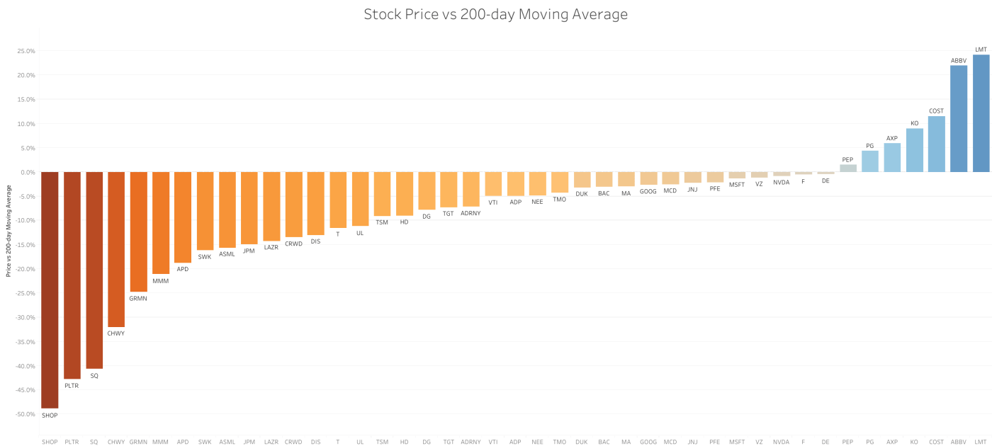
= B1/AVERAGE(QUERY(GOOGLEFINANCE(A1,"close",WORKDAY(TODAY(),-200),TODAY()),"Select Col2"))-1Once you have this data for all the stocks in your portfolio, a great way to visualize and share it is to connect the Google Sheet to Tableau Public. Here is the visualization I made of all the stocks in my portfolio (including my watchlist):

Click on the image to open it on Tableau Public, where it will be a lot more interactive and up-to-date (unfortunately, WordPress does not allow me to embed the interactive “viz” directly on this page). From left-to-right, this figure shows the stocks that a trading the cheapest relative to their 200-day moving average price (200dMA). The more negative this percentage is, the more these stocks have fallen from their recent highs (perhaps oversold?). Stocks with a strongly positive percentage, however, are showing positive momentum and are in a general uptrend (or perhaps overbought?). These are useful data points to have, in case you want to deploy new funds to the portfolio or rebalance your current holdings.
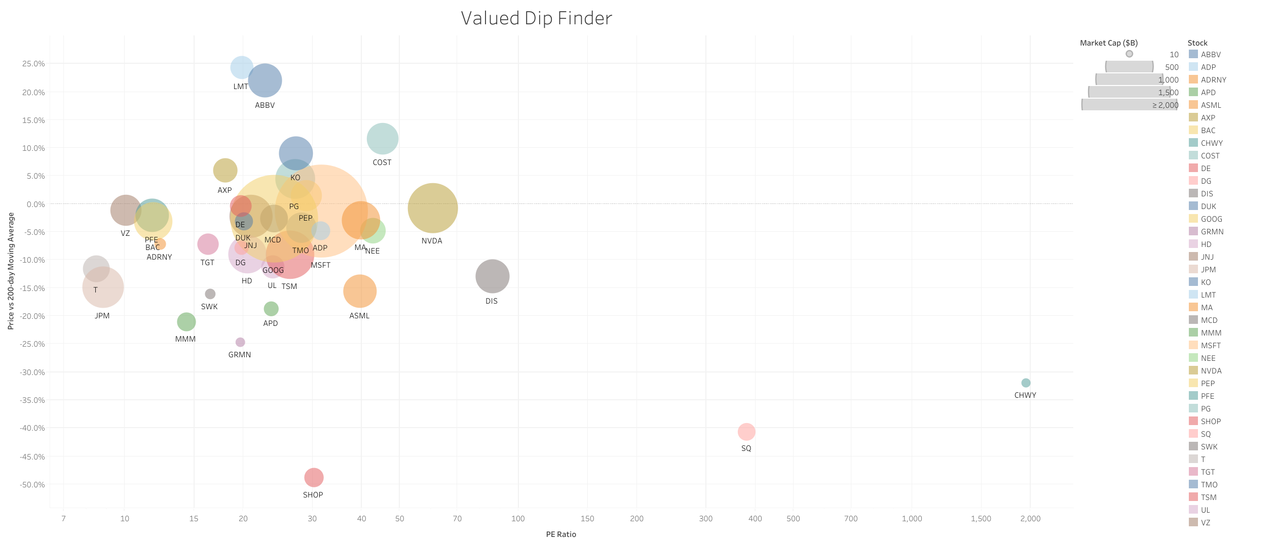
Here is another version of this information (on the y-axis), but now I have added two more dimensions to the visualization: the “price-to-earnings ratio” (or PE ratio, on the x-axis) and the market capitalization of the company in billions of dollars (size of the bubbles). These give some more insight into how risky a certain stock is. For example, stocks at the bottom of the chart might have fallen the most from their 200dMA, but if they are also on the right side of this chart (high PE ratio) they might still be strongly overvalued. Maybe the stocks at the bottom left of the cloud are a much safer bargain.
These are just two ways to look at your portfolio. Of course there are many more dimensions that should be part of a decent stock analysis (be it qualitative, fundamental or technical), and there are numerous free websites that can assist you with this process. Just know that whenever they don’t have the visualization that you need (or want), you can always build your own.

Leave a comment